Best Practice
Web Programming
The following are general guidelines to proper coding practice in Web programming. All programming assignments must follow these good practice guidelines (and so should real-world code).
[ Naming | Structure | DoC | Validation | Mobile-First ]
Naming Conventions
All file names should be lowercase and contain ONLY letters, numbers, dash, underscore, and one period for the extension. File names should start with a letter and should NOT contain spaces.
Structural Elements
- <p> should not be used as a container like a <div>. Paragraphs are for text, nothing else. Do not use <p> as a block element for page structure. Do not put other block elements inside <p> tags.
- Tables may NOT be used to format a page. Tables are strictly for tabular data display.
- Do not put header tags <h1> <h2> etc. inside things like <ul> or <p>. Header tags are usually stand-alone elements. Header tags may go inside <div>
Division of Concerns
aka Separation of Concerns
[ back to top ]
Web programming generally requires working in multiple languages (sometimes simultaneously). Depending on the task at hand you may work in one or more of the following and all within the same Web application.
- Client-side formatting languages: HTML, CSS
- Client-side programming language: JavaScript
- Server-side programming language: PHP, JavaScript (i.e. Node.js), Ruby, Java, C#, Python, etc.
- Server-side query language: MySQL, SQL, NoSQL, etc.
Because of the use of multiple languages that have very little in common but work together very closely, many developers are tempted to mix languages. DO NOT DO THIS! Even if you see it done by an experienced programmer, or in a textbook, or in an online resource - it is still wrong.
Division (or Separation) of concerns is a design principle for separating an application into distinct "modules", so that each section directly addresses a separate concern, no more, no less. In Web programming our “concerns” are:
-
User Interface and User Experience (UI/UX): This is the
visible part of the program that the user will see and
with which the user will interact (aka “front-end” or
"client-side"). This is generally handled with HTML,
CSS, and JavaScript. This is further broken down
into these concerns:
- Structure: HTML
- Formatting: CSS
- Functionality: JavaScript
-
Server Side Processing: This is the “back-end” of the
application where information is processed on the server
and server side requests are handled.
This is further broken down into these concerns:
- Processing: Some server side language (PHP, Node.js, Ruby, Python, etc.)
- Database: Some query language (MySQL, SQL, etc.)
Those concerns are further broken down into even smaller concpets until each concern is a single, easily quantifieable concept.
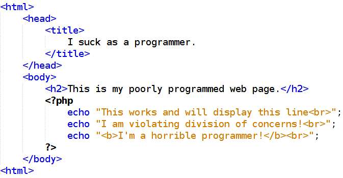
Concerns should not mix. Examples of mixing client-side concerns:
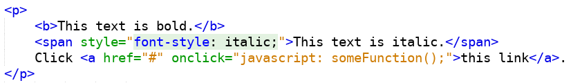
In the code above all of the following violates Separation of Concerns.
- The bold tag <b> is formatting. It should not be done in HTML. This should be handled in CSS.
- The <span> tag contains CSS (known as in-line CSS). CSS and HTML should not be mixed.
- The link uses an onclick event (known as in-line JavaScript). HTML and JavaScript should not be mixed.
This code done properly would look like this.
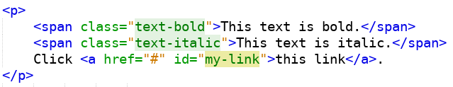
The code above contains pure HTML. i.e. The “concern” of structuring the page has been separated from formatting and functionality. Then in separate files we add the CSS and JavaScript.
File: main.css
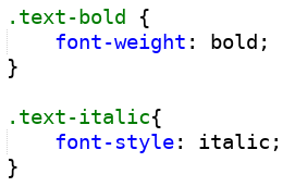
File: main.js
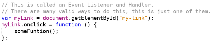
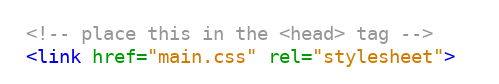
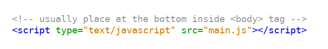
Those files above can now be linked to our HTML using the link tag like so.
Now our concerns are properly separated. This has many advantages.
- Readability: All our code is more readable since each file is one-and-only-one language.
- Maintainability: This code is easier to maintain.
- Fewer Bugs: When you can focus on one-and-only-one language at a time, you will write fewer bugs.
- Collaboration: By separating your concerns, you can work in a team more effectively. A designer can work on HTML and CSS, and a programmer can work on JavaScript, and no one will step on each other.
The following is an example of mixing client-side and server-side concerns. This code will process the PHP portion on the server, and then deliver the result along with the client-side code back to the browser. Do not do this! This is one of the worst examples of mixing concerns as it both violates language and functionality concerns, but also client and server concerns. Correcting this and creating properly structured code will be discussed in class.
Input Validation
[ back to top ]Input validation and security are some of the most important topics in Web development. The following are best practice guidelines for real-world applications and required for assignments in Web Development classes.
- Do not rely on client side validation. Client side validation is strictly for user experience and has nothing to do with security.
- Do not allow sensitive information or corruptable information to pass via the URL query string. Query strings should be failsafe and non-sensitive information.
- Do not perform exec() type functions on any user input.
- Server side validation should be done as if no input checking was done and anything can show up on the server.
- All of the following should be done to all input by default:
- Trim White Space: remove white space before and after all strings
- Strip Tags: strip any potential html tags from input or convert them to some neutral form that can be safely read later
- Sub String: cut any input string down to a safe length that you know guarantees you are not exceeding any size limits internal to your application while also preserving the intended valid input
- Convert Quotes: convert quotes to some neutral form that will not interfere with processing later, e.g. escaping
- Convert and Store: convert and store input into neutral standardized forms that can be safely processed later by standard and/or built in functions. e.g. JSON, XML
-
In addition to all default operations, anything that
may be placed into a database must be cleansed and escaped.
SQL injection
is one of the most common and dangerous security threats
on the Web. It is also very well understood, easy to detect,
and easy to prevent. There is not an excuse for allowing
SQL injection. Use any/all of the following by default on all
input where the destination is a database.
- Code Level Cleansing: Process all input into neutral forms that cannot contain SQL code or snipits. Use of ORMs and/or frameworks that contain mapping mechanisms is the easiest way to achieve this, but it can be done manually as well (if done carefully).
- Prepared Statements: a prepared statement takes the form of a template into which constant values are substituted during each execution.
- Escaping: Escaping is the process by which "dangerous" characters are "escaped" by prepending backslashes to things like quotes and newlines. Most languages and frameworks have built in escaping mechanisms.
- Pattern Check: Check to make sure that your input conforms to the type you are expecting. Do not look for all the potential problems and eliminate them, but rather do the reverse, look for the one-and-only-one pattern/type you are expecting and throw out anything that does not match it.
- Database Permissions: Use only the minimum database permissions you need at the time, nothing more, nothing less. If an application only needs to read data, set up that programatic "user" to only read. If an application only needs to write to one table, set it up to only write to that one table.
Mobile-First, Mobile-Friendly, and Responsive Code
[ back to top ]Mobile-First: Mobile-First means we assume all default CSS and styling is for a mobile device. We code for a very small screen first, not worrying about what it looks like on Desktops. Then when we're done with that, we go back and make exceptions for Desktop view using media queries. Mobile-First is a coding process and has nothing to do with Mobile-Friendly or Responsive design. It is simply stating what we code first as the default case. Read all of the following to learn about Mobile-First.
- What is Mobile-First Design?
- How To Write Mobile-First CSS
- Creating a Mobile-First Responsive Web Design
Mobile Friendly: Mobile-Friendly is a design style that says your pages look well designed and tailored to very small screens. It is not a coding style, it is a design style. It does not mean your application looks bad on large screens, it simply means you application also looks good on mobile devices.
Responsive: Responsive web applications
are one's for which the pages automatically resize based on
the device you are using to view the page
and will also resize dynamically when the browser window is resized.
For example, this site is responsive. Try resizing the window and you will see the page resizes and restructures to keep up with window size.
A simple test for a responsive site is to look for a horizontal scrollbar when the window is made narrower. If you see a horizontal scrollbar anywhere above about 180px, the site is not responsive (or at least not properly responsive). You should not see a horizontal scrollbar on your sites except possibly at extremely small and unrealistic resolutions (180px and below).
All elements in a responsive site should re-arrange and re-size dynamically with window size and with device changes so as to be optimal for that screen/window size.
- Images should get smaller as the window decreases in size up to a point (around 600px) and then should get bigger. Usually at that point, the image should be styled to take up the whole width of the screen.
- Text should not get smaller as the window decreases in size and should get bigger on small screens (below 600px).
- Blocks like <div> that are in-line and side by side on large screens should expand to 100% screen width on small screens and each block that was in-line should drop down and stack one on top of the other.
Mobile-First, Mobile-Friendly, and Responsive are NOT the same things. Mobile-first simply says your CSS is structured so that mobile css is default and other CSS is secondary. Mobile-Friendly says your application looks good and is also tailored to small screens. Responsiveness is how your pages respond dynamically to screen size changes.
It is possible to write Mobile-First and not Mobile-Friendly, or Mobile-Friendly and not Responsive, or any combination of the three concepts described here, however there would be no point to it because it would make a poor quality site and code that is difficult to maintain.
For example, you can write Desktop-First and Responsive, but your code would be much more complex and harder to maintain. You can write Mobile-Friendly and not Responsive, however your code would look terrible on desktop,
Although you can mix and match any <device>-first, <device>-friendly, and responsive or not-responsive, the current accepted best practice today is Mobile-First, Mobile-Friendly, and Responsive.All code produced in Web Development classes must be Mobile-First, Mobile-Friendly, and Responsive.